

PCA of Fixed-Income Returns
Level, Slope, and Curvature explain most observed changes to the yield curve.

The principal components of bond yields are intuitively interpretable as level, slope, and curvature changes. Viewing fixed-income risk as a combination of these factors, rather than changes in yields over different maturities, reduces dimensionality, simplifies the analysis, and captures most yield curve variations with uncorrelated factors. This post assumes a familiarity with the yield curve (the FT has a good article that discusses it) and PCA (there is a good Medium article on it, or just Google it).
The Yield Curve
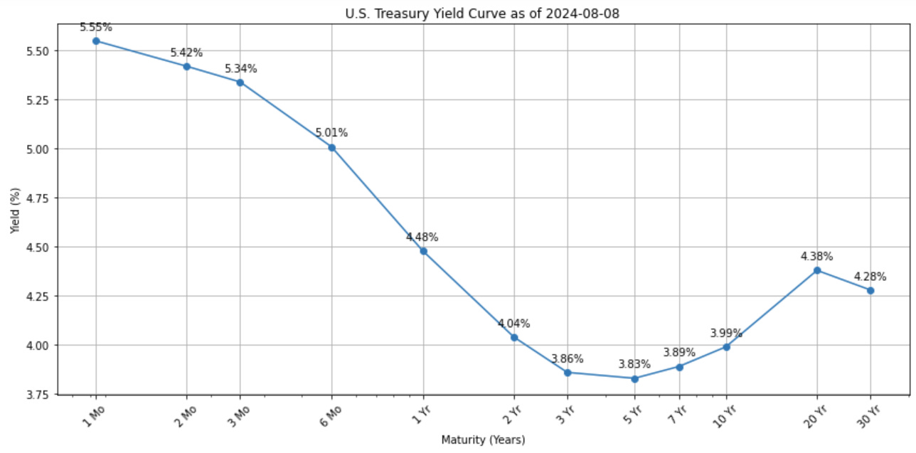
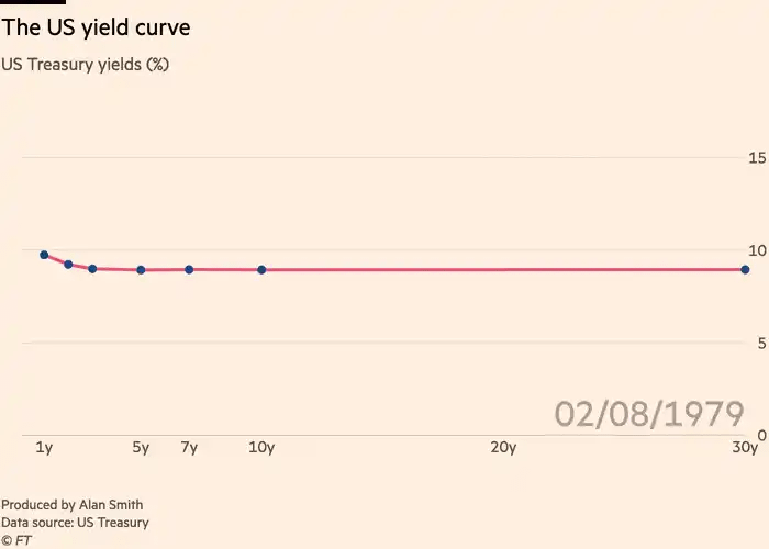
The yield curve is a graphical representation of the relationship between interest rates and the time to maturity for bonds of equal credit quality. It typically shows the yields of U.S. Treasury securities for various maturities, ranging from short-term bills to long-term bonds. A normal yield curve slopes upward (x axis is maturity and y axis is yield to maturity), with longer-term bonds offering higher yields to compensate for the increased risk of holding them over a longer period. An inverted yield curve, where short-term rates are higher than long-term rates, suggests that future rates will be lowered by the federal reserve (typically to stimulate economic activity) and thus is seen as a predictor of economic recession. The graph below shows the current yield curve as of time of writing.
Bond Duration
The relationship between a bond's yield and its price is inverse: as yields rise, bond prices fall, and vice versa. This occurs because bonds are fixed-income securities with predetermined interest payments. When market interest rates increase, newly issued bonds offer higher yields, making existing lower-yielding bonds less attractive. Consequently, the prices of these existing bonds must decrease to make their effective yield competitive with new issues. Conversely, when market rates fall, existing bonds with higher interest payments become more valuable, and their prices rise. This inverse relationship is fundamental to bond investing and is often described by the concept of duration, which measures a bond's price sensitivity to changes in interest rates. The formula for the price of the bond is given by:
Where P is the bond price, C_t are the cash flows, y is the yield, and t is the time period. Take the derivative of P with respect to y gets us the rate sensitivity:
Divide both sides by P gets us the rate sensitivity in percentage terms:
The rate sensitivity of a bond’s price (in percentage terms) is called the modified duration, or just duration. It has an interesting connection to the “average” time that cashflows from the bond is received (called the Macaulay Duration). Define:
from which we can observe that
In any case, we note that the duration (D*) is approximately equal to the negative of the percentage change in a bond's price for a given change in yield. Specifically:
Note on Convexity
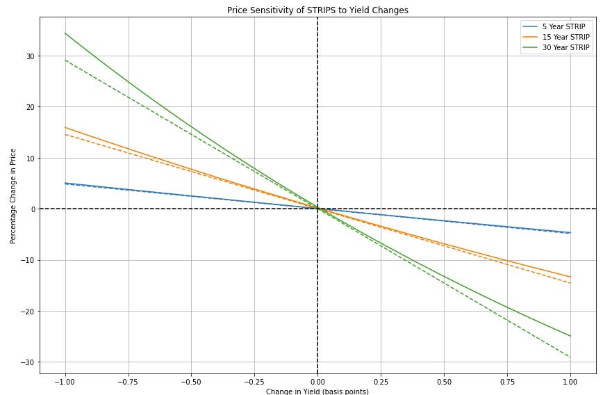
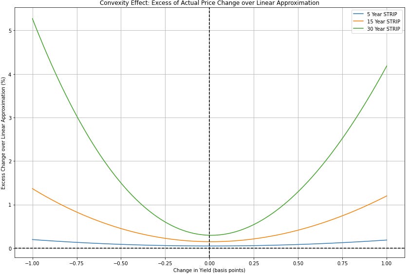
Clearly the price of bonds do not change linearly with rates. However, a linear approximation is typically good enough. The code below demonstrates the effect of convexity on STRIPS (Separate Trading of Registered Interest and Principal of Securities, i.e. zero-coupon bonds that pay face value) with maturities of 5, 15, and 30 years. The graphs shows how the prices of these zero-coupon bonds change as yields move from -100 to +100 basis points around an initial yield of 3%. The first graph shows the price change as well as the linear approximation, while the second graph shows the effects of convexity excess of the linear approximation. Convexity naturally becomes more pronounced for bonds with longer maturities.
Changes in the Yield Curve
The 3D visualization of the U.S. Treasury yield curve over the past 10 years reveals a dynamic and evolving interest rate environment. The surface plot shows significant changes in both the level and shape of the yield curve over time. In the earlier years of the decade, we can observe a generally upward-sloping yield curve, indicating higher yields for longer-term bonds. However, as we move through time, we see periods where the curve flattens and even inverts, particularly in the more recent years. Note that the short-end of the curve (representing shorter maturities) shows more volatility compared to the long-end of the curve.
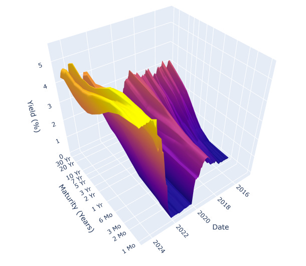
There is an NYT Article that gives a way better visualization than the one I give here with Chat GPT Code. The same type of visualization can also be accessed via the GC3D function on the Bloomberg Terminal. There is also an FT Article that turns changes in the yield curve into music.
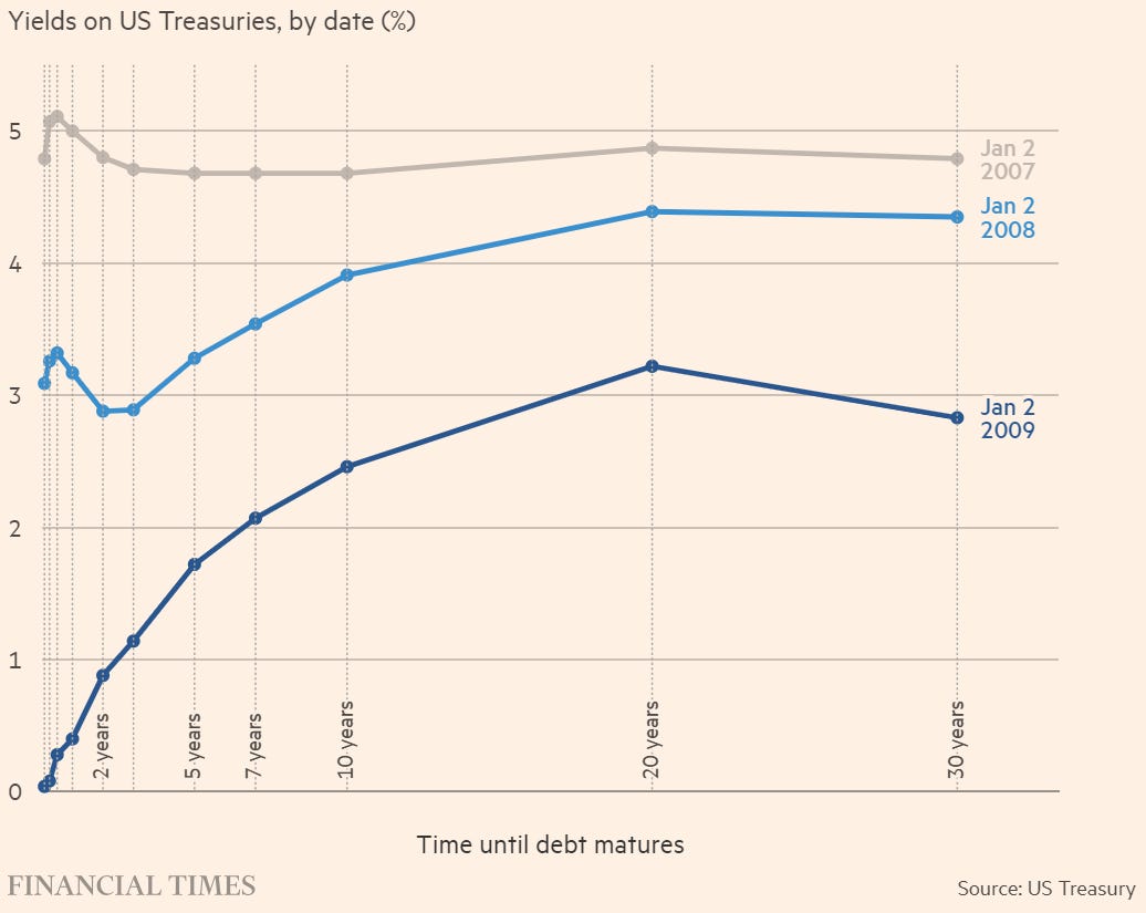
In any case, it should be clear that the yield curve’s changes are not equal across all maturities. Below is how the yield curve changed during the GFC:
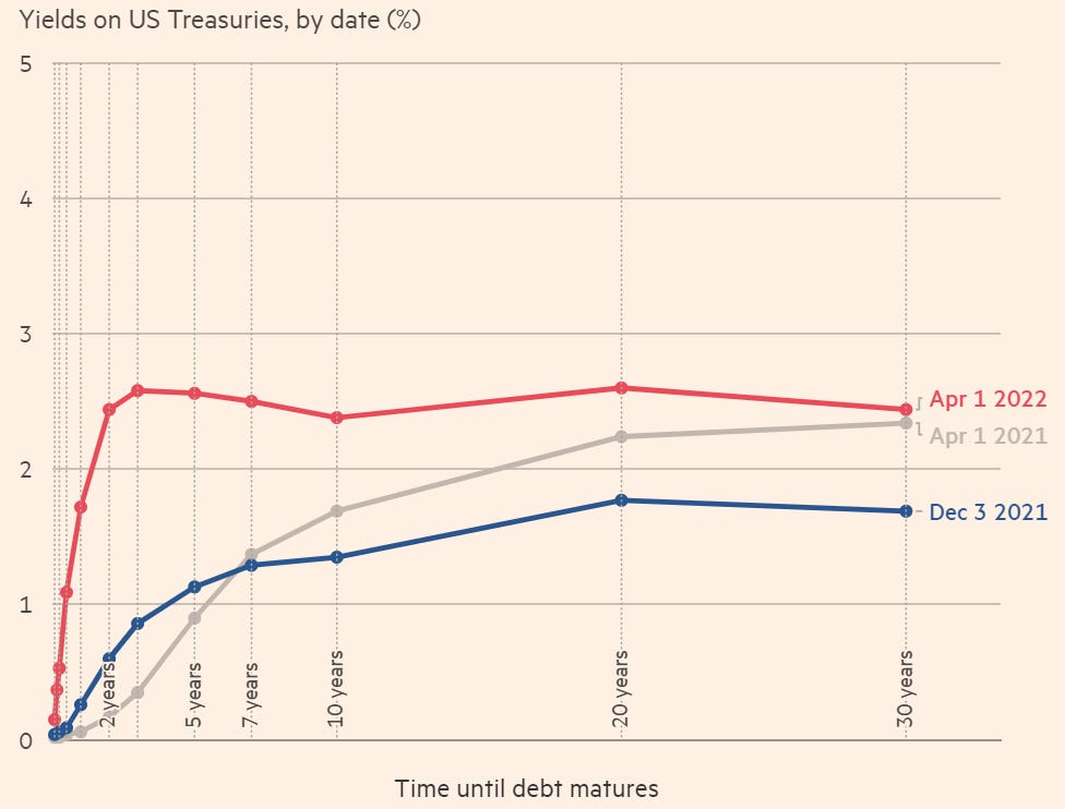
And below is how the yield curve changed shortly after COVID:
The Principal Components of Yield Curve Changes
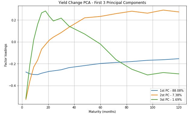
The following plot shows the factor loadings for the first three principal components across different maturities. Each line represents a principal component, and the legend shows the percentage of variance explained by each component. By construction, the principal components are orthogonal to each other, and hence their movements are not statistically correlated. The first principal component (PC1) typically represents a parallel shift in the yield curve. The second principal component (PC2) often represents a change in the slope of the yield curve. The third principal component (PC3) usually represents a change in the curvature of the yield curve. Typically, the first three components explain a large portion of the total variance, which is why they are often used to model yield curve dynamics. The data is from 1972 to 2000 taking from a UMD Repo.
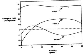
While PCA is a useful method to identify the factors that drive changes in bond portfolios, it is not perfect. One major issue is the unreliability of decompositions over short time periods, as these brief spans fail to provide sufficient information for accurate estimation of principal component loadings. This problem is compounded by the fact that economists argue about the “correct” designations of level, slope, and curvature (well, mainly what the curvature component should look like, level and slope are pretty intuitive and obvious). E.g. the Litterman and Scheinkman 1991 paper used different data and their principal components look like the following:
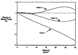
In price space, bonds are exposed to the factors as such:
The choice of covariance estimator also plays a crucial role, as different estimators can produce varying results, some performing notably better than others. In some cases, especially with limited data, the sample covariance matrix can generate overly flat eigenvectors, reducing their effectiveness in distinguishing impacts across different bond maturities. Some papers on the topics include Nelson and Siegel, 1987, Litterman and Scheinkman, 1991, Rodger Lord, 2007, and Kavir Patel, 2018.
In general, for yield curve movements, the first three principal components typically explain a large portion of the total variance, often around 95-99%. The breakdown is usually as follows: PC1 = 70-90%. PC2 = 5-15%. PC3 = 2-5%. The exact percentages can vary depending on the specific time period, market conditions, and the particular yields or instruments used in the analysis. The remaining principal components usually explain very small portions of the variance and are often considered noise.
The Driver of Bond Returns
We see that different principal components (PCs) affect yield changes across various maturities of the yield curve. From the analysis of the UMD data, for shorter-term yields (~12 and 36 months), PC1 dominates, explaining about 60% of the variance, with PC2 and PC3 each accounting for roughly 20%. This suggests that short-term rates are primarily influenced by overall level shifts in the yield curve, likely reflecting changes in monetary policy.
As we move to medium-term yields (~60 to 84 months), we see a significant shift. PC2 becomes the dominant factor, explaining nearly 60% of the variance, while PC1's influence drops to about 40%. This indicates that changes in the slope of the yield curve, often associated with expectations of future economic growth or inflation, play a crucial role in medium-term yield movements.
For longer-term yields (~120 months +), we observe a more balanced influence of PC2 and PC3, with PC1's importance diminishing further. At the 120-month maturity, PC3 becomes the most influential, explaining about 45% of the variance. This suggests that long-term yields are more sensitive to changes in the curvature of the yield curve, which can reflect complex interactions between long-term economic expectations, risk premiums, and supply-demand dynamics in the bond market.
The discrepancy between our results and those of Litterman and Scheinkman (1991) highlights the non-stationary nature of financial markets and economic conditions. While Litterman and Scheinkman found a stronger influence of PC1 across all maturities, our results show a more varied impact of the principal components, particularly for longer durations. This variability poses a significant challenge for risk managers. Models and strategies that work well in one economic environment may not be as effective in another. For instance, a risk management approach that heavily weights level (PC1) risks based on historical data might underestimate the impact of slope (PC2) or curvature (PC3) changes in a different economic climate.
In the current economic environment, many investors are increasingly drawn to long-duration ETFs such as TLT (iShares 20+ Year Treasury Bond ETF) or its leveraged counterpart TMF (Direxion Daily 20+ Year Treasury Bull 3X Shares). These funds are attracting attention due to expectations of potential interest rate cuts and economic uncertainty. However, it's crucial for investors to understand that these instruments are not solely bets on the direction of interest rates (PC1 or level factor).
In fact, both our analysis and the Litterman and Scheinkman paper shows that long-duration bonds are significantly, and often more heavily, exposed to changes in the yield curve's slope (PC2) and curvature (PC3). For instance, past the 20 year maturity period, both our analysis shows that PC2 and PC3 combine to explain a majority of yield changes. This means that investors in these long-duration ETFs are taking on substantial exposure to complex interactions between long-term economic expectations, risk premiums, and supply-demand dynamics in the bond market, which go beyond simple interest rate predictions (in fact, by construction PC2 and PC3 are uncorrelated with PC1).
Indeed, our results reinforce the importance of considering multiple factors in risk assessment. Focusing solely on rate expectations, which primarily relates to PC1, would be akin to considering only market risk (beta) in an equity portfolio. While PC1 is undoubtedly important, accounting for a large portion of overall yield curve movements, our analysis shows that PC2 and PC3 become increasingly significant for longer-duration bonds. This multi-factor approach in fixed income risk management parallels the consideration of sector and style risks in equity portfolios. Just as an equity portfolio focused on a particular sector would need to account for both market and sector-specific risks, a bond portfolio, especially one with longer durations, needs to consider not just overall interest rate levels but also slope and curvature.
Code for Graphs
Imports
import yfinance as yf
import numpy as np
import pandas as pd
import matplotlib.pyplot as plt
import requests
from io import StringIO
import yfinance as yf
import plotly.graph_objects as go
from sklearn.decomposition import PCA
from mpl_toolkits.mplot3d import Axes3D
from datetime import datetime, timedelta
Yield Curve
# Fetch current yield curve data from U.S. Treasury website
url = "https://home.treasury.gov/resource-center/data-chart-center/interest-rates/daily-treasury-rates.csv/2024/all?type=daily_treasury_yield_curve&field_tdr_date_value=2024&page&_format=csv"
response = requests.get(url)
data = pd.read_csv(StringIO(response.text), parse_dates=['Date'])

# Get the most recent date's data
latest_date = data['Date'].max()
latest_data = data[data['Date'] == latest_date]

# Extract maturities and yields
maturities = ['1 Mo', '2 Mo', '3 Mo', '6 Mo', '1 Yr', '2 Yr', '3 Yr', '5 Yr', '7 Yr', '10 Yr', '20 Yr', '30 Yr']
yields = latest_data[maturities].values[0]

# Convert maturities to numeric values (in years)
maturity_years = [1/12, 2/12, 3/12, 6/12, 1, 2, 3, 5, 7, 10, 20, 30]

# Create the plot
plt.figure(figsize=(12, 6))
plt.plot(maturity_years, yields, marker='o')
plt.title(f'U.S. Treasury Yield Curve as of {latest_date.date()}')
plt.xlabel('Maturity (Years)')
plt.ylabel('Yield (%)')
plt.xscale('log')  # Use log scale for x-axis to spread out short-term rates
plt.xticks(maturity_years, maturities, rotation=45)
plt.grid(True)

# Add yield values as text above each point
for i, txt in enumerate(yields):
    plt.annotate(f'{txt:.2f}%', (maturity_years[i], yields[i]), textcoords="offset points", xytext=(0,10), ha='center')

plt.tight_layout()
plt.show()
Convexity
import numpy as np
import matplotlib.pyplot as plt

def bond_price(face_value, yield_rate, years):
    return face_value / (1 + yield_rate) ** years

def plot_price_changes(years, initial_yield, yield_changes):
    face_value = 100
    yields = initial_yield + yield_changes

    fig, (ax1, ax2) = plt.subplots(2, 1, figsize=(12, 16))

    for maturity in years:
        prices = [bond_price(face_value, y, maturity) for y in yields]
        percentage_changes = [(p - prices[len(prices)//2]) / prices[len(prices)//2] * 100 for p in prices]

        # Actual price changes
        ax1.plot(yield_changes * 100, percentage_changes, label=f'{maturity} Year STRIP')

        # Linear approximation
        duration = maturity / (1 + initial_yield)
        linear_changes = [-duration * y * 100 for y in yield_changes]
        ax1.plot(yield_changes * 100, linear_changes, linestyle='--', color=ax1.lines[-1].get_color())

        # Excess over linear approximation
        excess = [actual - linear for actual, linear in zip(percentage_changes, linear_changes)]
        ax2.plot(yield_changes * 100, excess, label=f'{maturity} Year STRIP')

    ax1.set_xlabel('Change in Yield (basis points)')
    ax1.set_ylabel('Percentage Change in Price')
    ax1.set_title('Price Sensitivity of STRIPS to Yield Changes')
    ax1.legend()
    ax1.grid(True)
    ax1.axhline(y=0, color='k', linestyle='--')
    ax1.axvline(x=0, color='k', linestyle='--')

    ax2.set_xlabel('Change in Yield (basis points)')
    ax2.set_ylabel('Excess Change over Linear Approximation (%)')
    ax2.set_title('Convexity Effect: Excess of Actual Price Change over Linear Approximation')
    ax2.legend()
    ax2.grid(True)
    ax2.axhline(y=0, color='k', linestyle='--')
    ax2.axvline(x=0, color='k', linestyle='--')

    plt.tight_layout()
    plt.show()

# Parameters
years = [5, 15, 30]
initial_yield = 0.03  # 3%
yield_changes = np.linspace(-0.01, 0.01, 100)  # -100 to +100 basis points

plot_price_changes(years, initial_yield, yield_changes)
Yield Curve (3D)
# Function to fetch data for a given year
def fetch_data(year):
    url = f"https://home.treasury.gov/resource-center/data-chart-center/interest-rates/daily-treasury-rates.csv/{year}/all?type=daily_treasury_yield_curve&field_tdr_date_value={year}&page&_format=csv"
    response = requests.get(url)
    return pd.read_csv(StringIO(response.text), parse_dates=['Date'])

# Fetch data for the last 10 years
end_date = pd.Timestamp.now().floor('D')
start_date = end_date - pd.Timedelta(days=10*365)
all_data = pd.concat([fetch_data(year) for year in range(start_date.year, end_date.year + 1)])

# Filter data for the last 10 years
all_data = all_data[(all_data['Date'] >= start_date) & (all_data['Date'] <= end_date)]

# Define maturities
maturities = ['1 Mo', '2 Mo', '3 Mo', '6 Mo', '1 Yr', '2 Yr', '3 Yr', '5 Yr', '7 Yr', '10 Yr', '20 Yr', '30 Yr']
maturity_years = [1/12, 2/12, 3/12, 6/12, 1, 2, 3, 5, 7, 10, 20, 30]

# Get yield curves at monthly intervals
dates = []
yield_curves = []
current_date = end_date
while current_date >= start_date:
    closest_date = all_data['Date'][all_data['Date'] <= current_date].max()
    if pd.notna(closest_date):
        dates.append(closest_date)
        yield_curves.append(all_data[all_data['Date'] == closest_date][maturities].values[0])

    current_date -= pd.Timedelta(days=30)  # Approximately monthly
yield_curves.reverse()
dates.reverse()

# Create the 3D surface plot
fig = go.Figure(data=[go.Surface(z=yield_curves, x=maturity_years, y=dates)])

# Update layout
fig.update_layout(
    title='U.S. Treasury Yield Curve Term Structure (Past 10 Years)',
    scene=dict(
        xaxis_title='Maturity (Years)',
        yaxis_title='Date',
        zaxis_title='Yield (%)',
        xaxis_type="log",
        xaxis=dict(ticktext=maturities, tickvals=maturity_years)
    ),
    width=1000,
    height=800
)

# Show the plot
fig.show()
PCA of UMD Data
# Load data
url = "http://econweb.umd.edu/~webspace/aruoba/research/paper5/DRA%20Data.txt"
df = pd.read_csv(url, sep='\t')

# Extract yield data and convert to percentage
yield_data = df.iloc[:, 1:18] / 100
maturities = [3, 6, 9, 12, 15, 18, 21, 24, 30, 36, 48, 60, 72, 84, 96, 108, 120]

# Calculate yield changes
yield_changes = yield_data.diff().dropna()

# Perform PCA on yield changes
pca = PCA()
pca_result = pca.fit_transform(yield_changes)

# Extract the first three principal components
components = pca.components_[:3]

# Calculate variance explained
variance_explained = pca.explained_variance_ratio_[:3] * 100

# Plotting function
def plot_factor_loadings(loadings, variance, title):
    plt.figure(figsize=(10, 6))
    for i, loading in enumerate(loadings):
        plt.plot(maturities, loading, linewidth=2, label=f'{i+1}st PC - {variance[i]:.2f}%')
    plt.xlabel('Maturity (months)')
    plt.ylabel('Factor loadings')
    plt.title(title)
    plt.legend(loc='best')
    plt.grid(True)
    plt.show()

# Plot the factor loadings
plot_factor_loadings(components, variance_explained, 'Yield Change PCA - First 3 Principal Components')

# Print variance explained
print("Variance explained by the first three principal components:")
for i, var in enumerate(variance_explained):
print(f"{i+1}st PC: {var:.2f}%")Disclaimer
The information provided on TheLogbook (the "Substack") is strictly for informational and educational purposes only and should not be considered as investment or financial advice. The author is not a licensed financial advisor or tax professional and is not offering any professional services through this Substack. Investing in financial markets involves substantial risk, including possible loss of principal. Past performance is not indicative of future results. The author makes no representations or warranties about the completeness, accuracy, reliability, suitability, or availability of the information provided.
This Substack may contain links to external websites not affiliated with the author, and the accuracy of information on these sites is not guaranteed. Nothing contained in this Substack constitutes a solicitation, recommendation, endorsement, or offer to buy or sell any securities or other financial instruments. Always seek the advice of a qualified financial advisor before making any investment decisions.